This is a story that will be useful for those suffering from conditions that are affected by barometric pressure, and also for any kind of researcher. Seriously.
One of the known triggers for my Willis-Ekbom syndrom (or restless legs) is changes in barometric pressure. There’s plenty of others, which can make accurate measurement or correlations difficult as well, but I’ve got lots of anecdata of knowing when the weather’s changing, and whether it’s a warm or cold front by whether I hurt before or after the rain comes. I even experience it when I drive from Pittsburgh to SW Ohio – it’s higher elevation, so the air pressure increases when I drive west. So I knew there was something there.
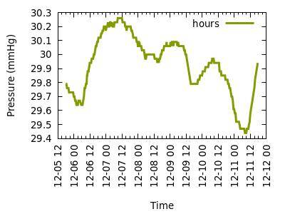
But despite that anecdata, I’ve been trying to quantify that correlation for years with only minimal success. The best I’d come up with so far was collecting the data and then graphing it out out programattically for different intervals, like these two graphs:

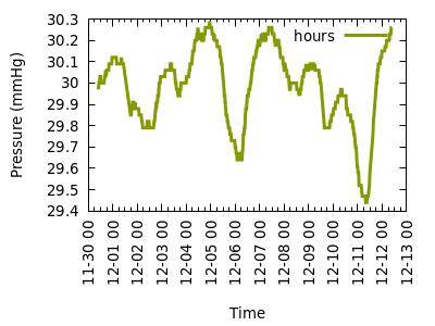
Looking at the different time ranges, it definitely meshed with my anecdata and helped me realize that it was change in pressure, a bit worse with increasing change than decreasing, and could give me something to point to after a particularly bad bout of pain and symptoms.
But no matter how meticulously I tried to record my symptoms, when I threw those numbers in with the barometer numbers, absolutely no correlation spit out, even though I experienced that correlation really acutely. Even if I looked at change over time (out to about three hours), there was no real correlation except in the most extreme of cases.
And then I decided to chart something different.
I wrote a script to do some math for me and display the data visually.
The data I had was formatted like this in a CSV (epoch time is seconds since 1 Jan 1970, useful for sequencing without doing more math):
Epoch time,date,hour,imperial,units,metric,units
1639576829,2021-12-15,08:00,30.23,in,1024,hPa
The measurements were in half-hour increments, and I wanted to keep that resolution of the data. For each line in the data, I had the script compare the metric units with the times before and give me the value of the change.
For example, if the pressure for 0730 was 1023 hPa, and 0700 was 1022 hPa, that line above would now read:
1639576829,2021-12-15,08:00,30.23,in,1024,hPa,-1,-2
And I had the script do that out for about 24-25 hours worth for each line. An example of the output is at https://gist.github.com/uriel1998/5531694b41dc54a004e05c3feeb09450 if you can’t see the embed below.
It’s worth noting that from this point onward, I chose to use the absolute value of change rather than parse positive and negative – both because it was easier, and because otherwise the chart got WAY complex with the limited terminal color output I was using. Each "block" is approximately 30 minutes of data out to about 25 hours, earliest times at the top of the chart. Warmer colors are higher differences in pressure.
As I built the part to display this as a color gradient, I kept being surprised about how large some of the changes were, particularly when you got out to the 24 hour range. And then when I actually ran the program … I could see the pressure changes roll through.
And then I started comparing my old graphs with the same time period in the charts….
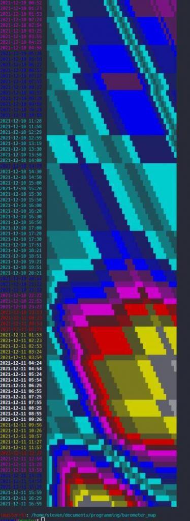
As I looked through the charts, I could see the bad storm that had passed through – and even see where the pressure started to rise again as the smear of blue in the bottom right of the charts. I also noticed that the left side of my charts was almost always in the "blue" range, even during that big storm.
That’s when it hit me: the change in pressure only really showed up when comparing the current pressure to times greater than three hours prior.
It’s not just slope that’s visualized here – though you get a sense of that as well – but a comparison to history that as far as I know, simply isn’t out there for consumer-grade people like myself to easily reference. If I had not looked further back than I (and apparently many websites) find "reasonable", I would not have stumbled upon this more useful data.
I hypothesize that the values of change over 6, 12, 18, and 24 hours will provide a greater predictive value as to how much pain I’m going to be feeling, and perhaps even provide warning of when I need to take meds earlier, or take extra medication. It may also be useful for people who suffer other conditions – sinus headaches, migraines, etc – which are triggered by barometric pressure. Future research includes seeing if keeping the sign value provides any useful predictive value.
I’m currently limited by my programming ability to output that data easily – and the code I have now is… bad. Real bad. Held together with twine and chewing gum bad. And collecting the data is a real-time activity that I had already set up. I’m going to do some more research, learn some more Python (to output "real" images), and collect some anecdata about how useful this really is and how other end users like myself can easily see and use this data without having to do a whole ton of set-up.
So, researchers: Don’t limit your data collection! Look beyond what you expect to see to find the data and correlations hiding in plain sight!
Fellow sufferers: When I come up with something more portable for end users, I’ll share it here! And in the meantime, while you’re looking at barometric data, look further back – you might be surprised at the correlations you find.