I Made A Lousy Book Cover Once. Learn From My (and Other’s) Mistakes

I made a lousy book cover.

It’s still out there.  Let me show you:

https://alliterationink.com/store.html#boughtlove

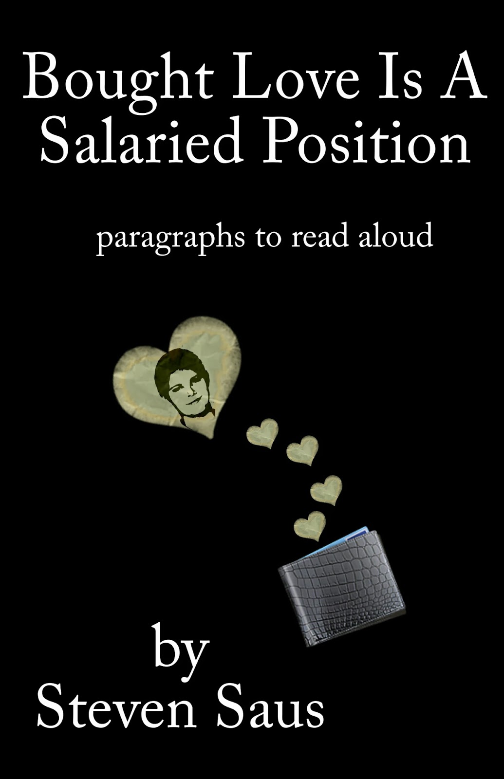
This is not a good book cover.  It breaks most of the design rules – and does so with no reason or purpose.  But I’m okay with it – it’s personal for me, and the book was put together largely for me.  So it meets my goals.   That doesn’t change the fact that it’s a lousy book cover.

It’s possible to put together a good book cover, though.  Consider this one:

https://alliterationink.com/store.html#pencils

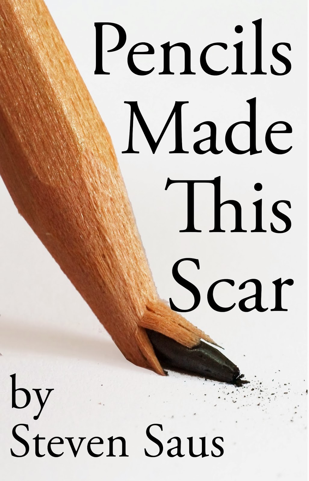
It gets noticed when I’m at conventions.  (The professional covers I pay artists quite a bit of money for get noticed consistently;  that’s a different issue entirely.)    People stop and look and flip through this book.  People buy this book at approximately three times the rate that they buy Bought Love is a Salaried Position

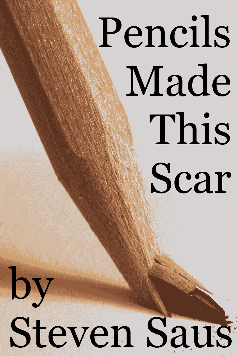
Or at least, they do now.  When I first started, I had a version of this book with a slightly different cover (you can actually see it in the thumbnail at the webstore):

And this cover got far, far less attention.   It’s obvious now, when you’re looking at the two covers so close together.  The contrasts.  The slightly different font.  The whitespace.   (You might also see a few things that I could still improve, like the pencil positioning in the newer cover.)   
I bring these to your attention because it is really freaking hard to create a good book cover from scratch.   Derek Murphy (guest blogging on The Creative Penn) wrote a post that had a great first half about how and where to get images and choose colors.
So how do you learn what makes a good book cover?  Here’s my suggestion:  https://lousybookcovers.com/
You’ll start to see themes emerge.   Bad themes.  And just like critiquing someone else’s writing, you start to see where you make the same mistakes.
Which brings us to why I only recommend the first half of Derek Murphy’s post.  Because for all the great information in the first half, the second half is about using MS WORD to design images.  That’s like saying you’re going to use a claymore to spread butter on your toast.  
Okay, it’s not just because I hate Word with a passion nearly equal to Charles Stross’.  It’s because Mr. Murphy is essentially advising folks to use the cut-and-paste school of cover art design.  While cut-and-paste can work in skilled hands, it too often fails.  Again I’ll refer you to my own lousy book cover at the top of this post… and then I’ll point out there is a cut-and-paste category tag from Lousy Book Covers.

So after you get your book edited, don’t skimp on your cover design.