It’s really, really tempting to get fancy when designing your eBooks. I mean, there’s all sorts of nice things that you should be able to do. Even in my last example, when I showed where a background malfunctioned, the drop cap at the beginning of the chapter still worked, right?
Yeah… about that.
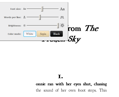
Again, this was part of a project for Jeff Carlson, where I was tweaking someone else’s work. Take a look at what happens to the drop cap when you start to mess with the font size:


Yes, that’s right. Eventually the drop cap is too big to fit on the page…. and wraps onto the next page of text.
Again, keep it simple. You want your design to draw attention to your words… but not so much that it distracts from what you’ve written.
Very good point! Simple is best for ebook formatting.