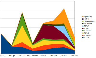
Here’s some graphs and numbers about the books Alliteration Ink has published over the last year. You can clearly see that fourth quarter in 2012 was not good – though the numbers seem to be trending back up (not pictured). You can also see where I realigned my reporting/payment calendar, so that December 2011 is a month by itself (and so there’s a sharp dip in the middle that’s artificial).
Some books did really well. Some have consistently chugged along. Some are actively growing as they find their audience.
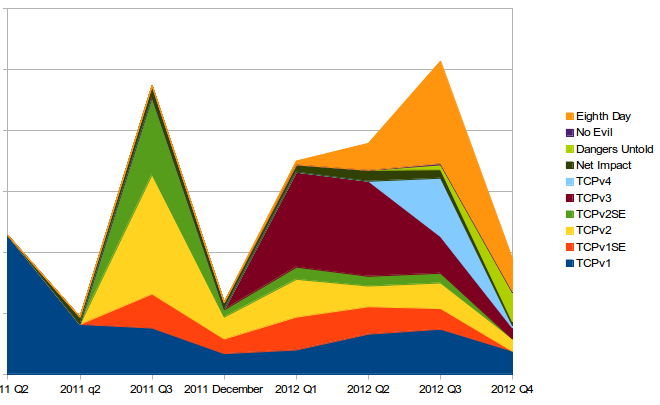
First, sales in terms of units sold (as before, these numbers do not include units moved by authors at conventions or on their own websites where they sell their author copies):
 |
|
| Stacked unit sales |
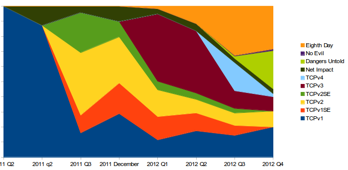 |
| Each book as a percentage of total sales |
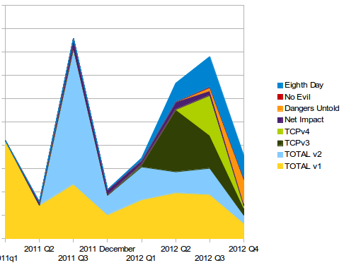
Next for sales in terms of money (see above caveat again):

As you keep adding books, things will get better. eBook publishing in particular is a matter of getting as many titles out there as possible. Here's hoping a best seller comes your way soon (and if that's SIDEKICKS! I'll be especially happy!)
Agreed. 🙂