Spend any amount of time in the eBook community, and you’ll find people who state their personal preferences as dogma. These are, however, preferences. For example, Passive Guy thinks eBooks should open at the beginning of the story, whereas I think the cover is still vital… to the extent that I feel cheated when the cover presented is just the “text cover” page. I like the analogy given in this Atlantic article (which PG quotes):
“I’m not sure they should be called ‘covers,’” says Bill McCoy, the director of International Digital Publishing Forum, which oversees the EPUB system. Rather, “It’s really more an introduction to the experience you’re going to have in consuming this content.” For McCoy, this is comparable to an entrée into a video game or DVD main menu page.
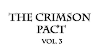
Which is about right. Consider the real cover for The Crimson Pact: Volume Three with the “text” inside cover:
 |
| Says “This Will Be Bad-ASS!” |
 |
| Says “We Chose A Font Other Than Papyrus!” |
But there are some aspects of eBook design that cannot be overlooked, no matter your personal preference. These problems don’t “fail to enhance”, they actively get in the way when someone is trying to read your book. (An earlier example is here.)
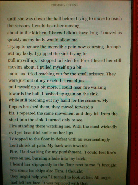
Particularly when you’re converting text from something like a PDF – which has hard carriage returns at the end of each line. Take a look at this real eBook, Crimson Intent:
That isn’t “ragged right” alignment. Those are hard returns throughout the text. One of my co-workers spontaneously came to me with this book. She said (and I’m barely paraphrasing):
“I could have overlooked the typos and random capitalizations here and there, but this is so hard to read! I have to keep going back and figuring out what they meant. Thank goodness it was free.“
You never want someone saying that about your work.
