I was discussing eBooks with Mike Stackpole at World Fantasy 1, and mentioned image resolutions. I’d just finished the conversion of Goldfish Dreams by Jim Hines, and the color nook had been announced. I’d been formatting my images with 256 colors. There’s two good reasons: It saved a LOT of space, and loaded a LOT faster with eInk 2. That color level also looked just fine with eInk’s black & white resolution.
“Yeah,” Mike said, “but more people are going to be reading with iPads and other devices that can handle larger sizes gracefully. And 256 colors is so 20th century.”
He’s got a point – the 256 colors looks crappy on my main computer. But that’s not the market I’m designing for. Just this morning (it’s Black Friday), quite a few eBook readers sold out of online outlets of box stores. The low-end readers as well.
There are ways to present different resolutions of images – Scott Westerfeld’s Behemoth for example, does it well with multiple sizes and formats of images. (The illustrations are gorgeous, and why I purchased a hardcover edition as well.) The eBook is also huge because of all the images – 24 megs when most eBooks are half a meg or so.
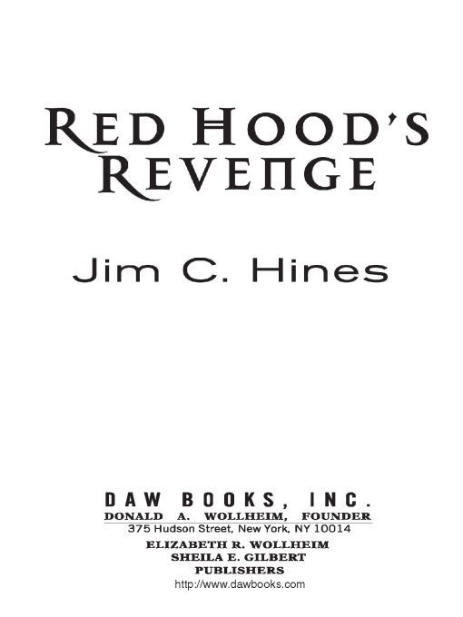
But I also know that no – or crappy – cover art is a significant annoyance. Several of the titles I’ve bought from large publishers simply have the title page (with its fancy font) as the cover image. That’s annoying as well; I like seeing the cover. For example, when I bought Jim Hines’ book Red Hood’s Revenge,
I was presented with this as the eBook cover:

When this is the real cover:

Maybe the best solution is to do something like what Behemoth does and have multiple versions of images. WIth only one major image per book, it won’t be a major issue for most.
What do you think? Are images – and I mean cover art and interstitial artwork here – important to your reading experience?
1 As I hobnobbed with the cremé de la cremé of authors, all possessing a certain je ne sais quoi along with several other phrases in other languages. Or in other words, I’m providing context for this musing, not just namedropping.
2 The only times I’ve had my Sony Reader crash were due to eBooks trying to load too many images – and page turns got a LOT slower if each “chapter” had many images in it.